Michael Fisher on The Block Collection & the Power of Colour
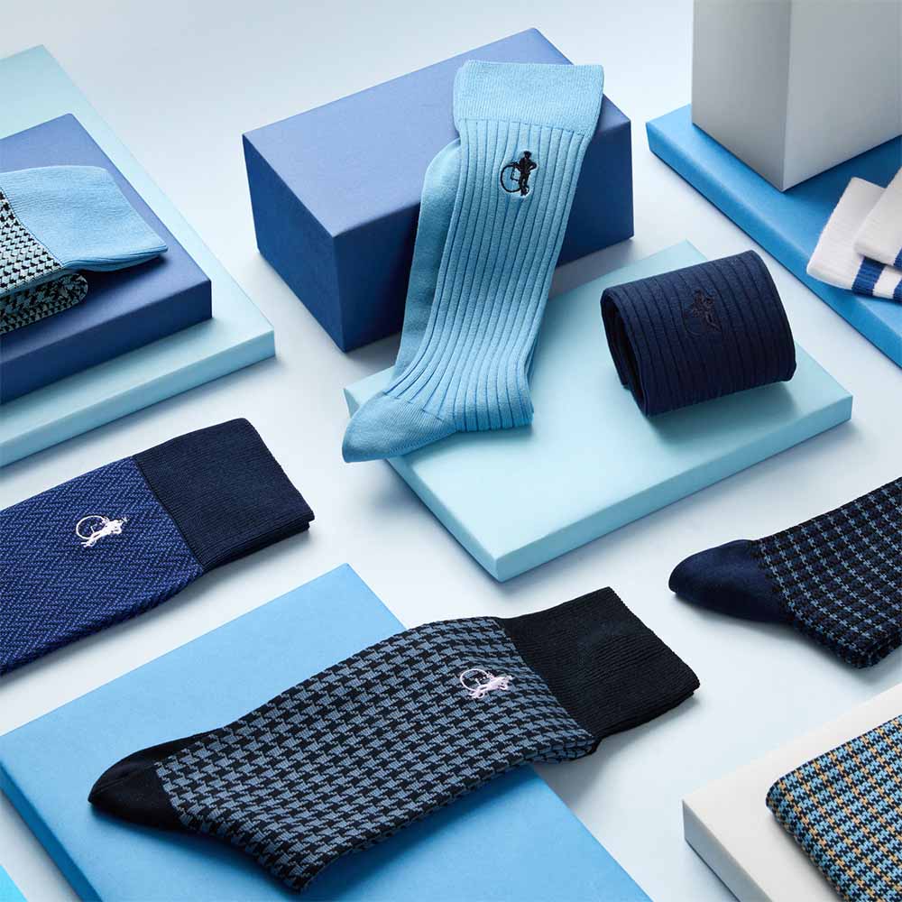
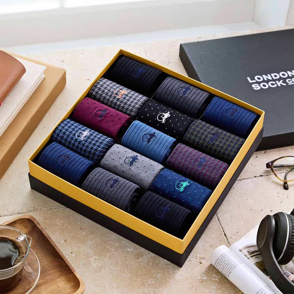
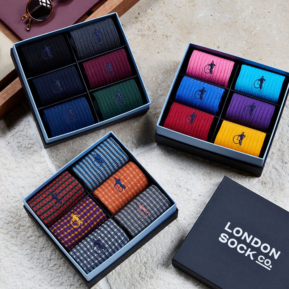
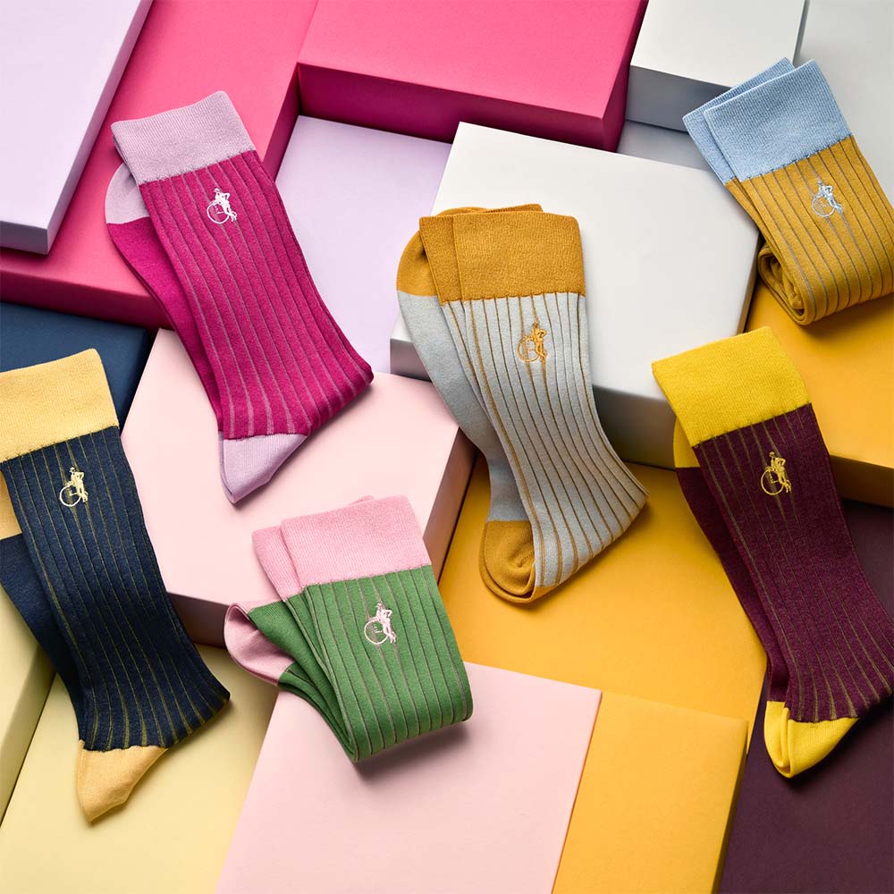
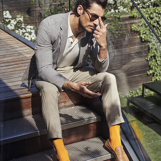
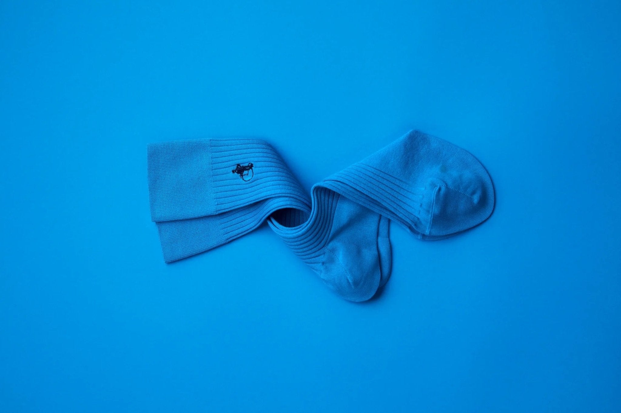
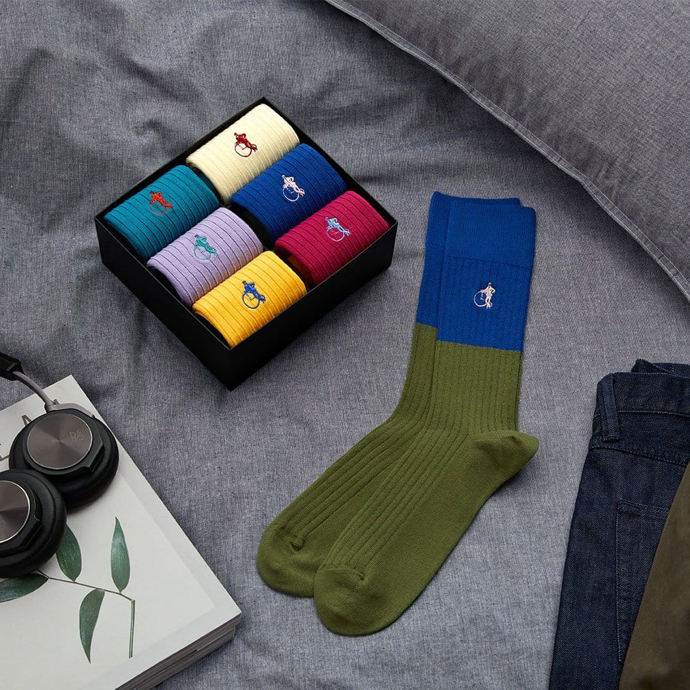
Celebrity stylist Michael Fisher is known for getting his clients noticed for the right reasons. By drawing on his years of expertise dressing some of Hollywood’s most stylish stars – including Hugh Jackman, James Corden, Jake Gyllenhaal, Michael Shannon, Bryan Cranston, Paul Rudd, and Adam Driver –and his passion for colour theory, he has created an exclusive collection for London Sock Company: The Block Collection.
We spoke to Michael to find out more about what inspires him, the power of colour…
You began your career as a photographer … Does that experience and eye for that art form influence your styling?
Absolutely. When on set I can anticipate what will make a good photo. I can think like a photographer and in 2D. More importantly I feel like my photography background has helped me in terms of forming a framework when styling. Photography is all about framing and narrative, so is styling. Both lead public perception and public opinion. I consider each carpet, each event, another frame in telling a story. Whether it’s campaign season, a press junket or an advertisement. I want there to be a cohesive narrative. I think of a story to tell.

What kind of clients are the most fun to work with?
Long term clients! The more history there is, the better the work is.
How did colour theory inspire this collection?
When I am styling, I am drawn foremost to colour – whether that’s a suit, shirt or sock. Once an item makes an impression, I use it as a foundation to build an outfit. This is the way I worked when designing these socks – finding my base colour and expanding a colour vocabulary from there.
What do you love about colour theory?
Colour theory is both a science and an art, based in fact but emotional. Being dyslexic, I often process information paradoxically. When I was in art school the principles of colour theory clicked with my thought process. I understood duality, the push and the pull. There was a connection between how my brain worked and how the colour chart was organised – the way things can oppose each other but can also compliment each other. What excites me most is chaotic pairings that are unharmonious and off-balance; this visual experience jars my brain, wakes up my palette and ultimately elicits a great response from the audience.
Do you think there is power in colour?
Absolutely! The power of colour is palpable and inescapable. Colour affects your behaviour, moods, and thoughts. Your reactions to colours are often deeply personal and rooted in your own experiences but can also be a universal bonding element. Colour triggers basic instincts and elicits reactions that are both physical and emotional.
What colour do you personally turn to when you need a boost?
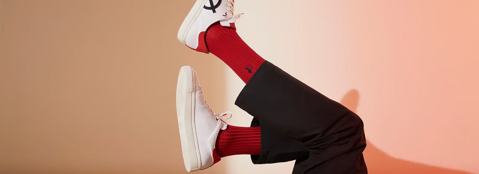
Red and it’s a blue red. NEVER an orange red. From a young age, I was attached to the colour. Maybe it has something to do with being an Aries but I find the colour a true mood elevator.
How do you want this collection to make people feel?
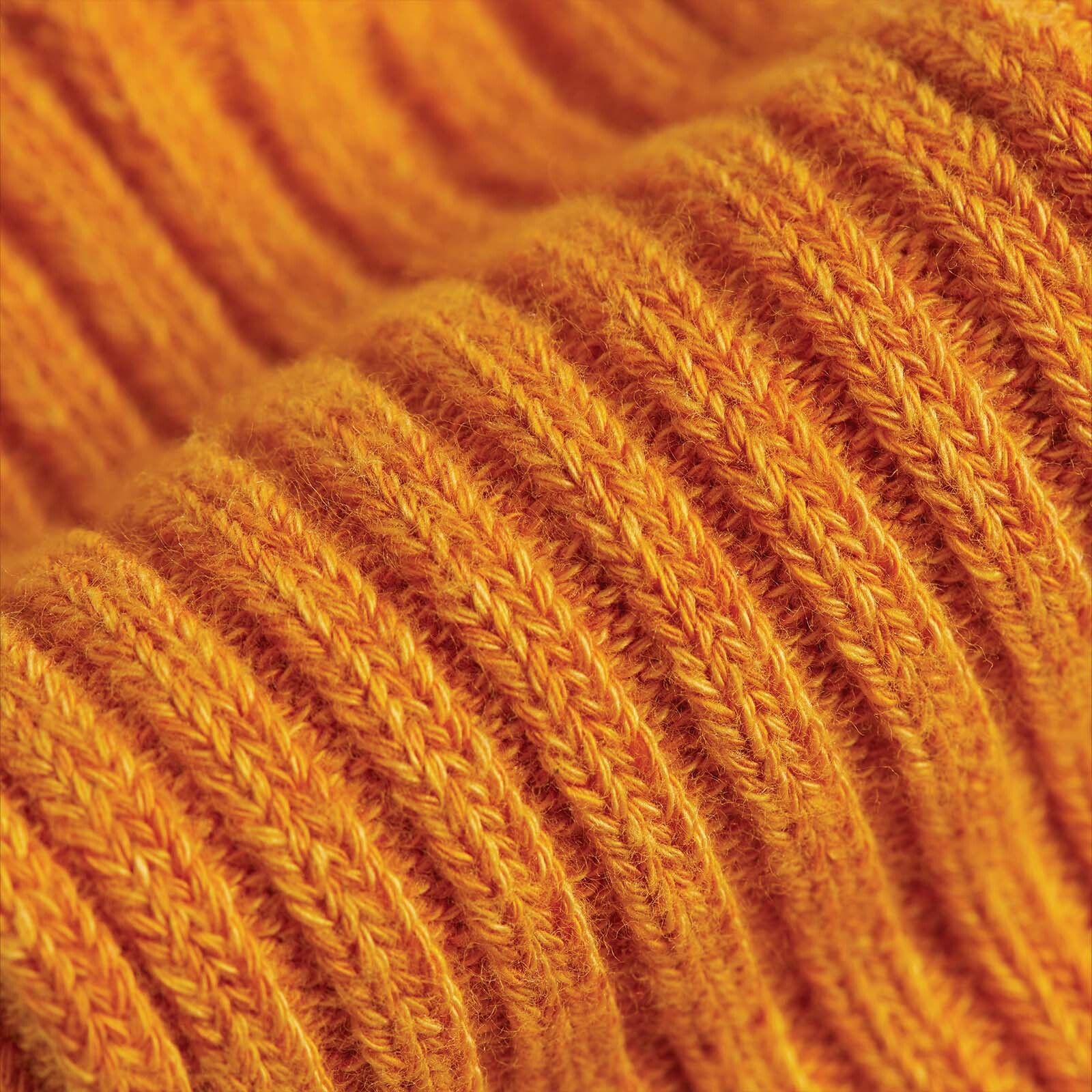
My goal through styling is always to make my clients look and feel like the best version of themselves. Socks for me have always been the ultimate feel-good item of a look. A new pair of socks is an instant mood elevator and I feel the same way about colour. I want these socks to pop and shock the eye. I want them to make an impression and evoke an emotion.

Do you have a favourite pair in the collection?
My favourite pair of socks is Smoke. It was a winner from the beginning. Never reworked or tweaked. It just looked right from the start.
